Thursday, December 8, 2016
Thursday, December 1, 2016
Wednesday, November 30, 2016
Monday, November 7, 2016
Thursday, November 3, 2016
Wednesday, November 2, 2016
Tuesday, November 1, 2016
Video Summary: Foundations of Typography | Color, Contrast & Scale
This video offered lots of useful information to think about when working with typography.
Fundamental considerations when making decisions regarding type:
- length
- format
- audience
- surface
Things to remember when working with text type:
- Aim for even color/tonalityFundamental considerations when making decisions regarding type:
- length
- format
- audience
- surface
Things to remember when working with text type:
- Content should play a role in the choice of typography
COLOR
- Consider the color of background against the color of type
CONTRAST: the degree of difference between two things"Everything exists in relationship to everything else."
Sunday, October 30, 2016
Friday, October 21, 2016
Calligraphy Demo with Heber Miranda
Considering I previously knew nothing about calligraphy, I found the
class demonstration quite interesting. Heber Miranda is a graphic
designer and calligrapher with design education from both City College
and SDSU. He currently works for MaeLin's design firm, Visual Asylum.
Heber
introduced us to many different calligraphy tools and techniques,
including cola pens, pilot parallel pens, ruling pens and various
calligraphy style brushes. He actually makes his own calligraphy pens,
which are beautiful ergonomic pieces handcrafted from wood and other
materials. The fact that he has (self-proclaimed) "terrible
handwriting" is fascinating, because his calligraphy strokes are rather
elegant and refined. Heber describes calligraphy as his "obsession,"
and after hearing about the endless hours he spends practicing, I have
a better understanding of the level of commitment and discipline necessary to
master this particular craft.
Heber referred us to a website to use as a resource for learning more about calligraphy: www.iampeth.com
Thursday, October 20, 2016
Monday, October 17, 2016
Amor + Keisuke
What a treat to meet Amor and Keisuke! Being a first-year student in the Graphic Design department, it was really inspiring to hear a personal success story that has its roots at City College. I enjoyed learning all about Amor and Keisuke's collective journey - Starting at City with their internships at Visual Asylum and Bennett Peji; their full scholarships to ArtCenter that lead to opportunities in Berlin and adventures at the Bauhaus; their passions for collaborative thinking and positive social impact, and their contributions in the Designmatters program; and finally their return to City College to pursue Future Studies.
Amor and Keisuke's presentation was full of
information and inspiration, but what struck me the most was their
teamwork, their tenacity and their refusal to take NO for an answer.
Amor gave a fantastic piece of professional advice (that's applicable to
any industry) when she said you have to create your own opportunities.
To succeed in any competitive field you have to think ahead and take
the initiative. And this creative team is living proof of that motto.
A few other tidbits that I found notable:
- Continue to build your virtual toolbox
- Always bring it back to the needs of the client
- Your OBSESSIONS are important
- Celebrate collaborative thinking
- Steps of design/creation process:
- Discovery
- Ideation
- Prototyping
- Implementation
Sunday, October 16, 2016
Thursday, October 13, 2016
Monday, October 10, 2016
Video Summary: Color for Design and Art
I learned a great deal from Jim Krause's interesting and informative video, Color for Design and Art. Below is an outline of some of the main points:
Color is a pulsation of electromagnetic energy.
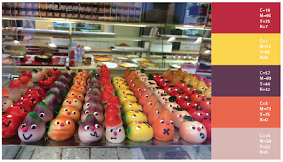
The color wheel is a designer's friend. Get to know it!
The properties of color can be described with three characteristics:
Color Systems
Color Wheel Based Palettes:
When choosing the "right color" for a client:
- Make sure it connects with the target audience
- Look for a color that's not currently being used by the client's competitors
- Choose a color that effectively represents the client's product
Methods of working with color when designing an illustration:
- Begin illustration by focusing on the value (all grays), and then substitute the colors.
- Choose a color you like, then create a palette based on that color
- Borrow color inspiration for famous painters: Vermeer, Klee, Klimt, Miro, etc.
Color is a pulsation of electromagnetic energy.
The color wheel is a designer's friend. Get to know it!
Primary Colors (red/yellow/blue)
Secondary Colors (orange/purple/green)
Tertiary Colors (one primary + one secondary color)
Hue (color)
Saturation (brightness or intensity)
Value (lightness/darkness)
Without value there can be no hue or saturation.
Color Systems
RGB (red, green, blue) is used for digital images on screen.
CMYK (cyan, magenta, yellow, black) is used for process color printing, with images printed as densities of tiny dots.
Spot Colors (aka Pantone/PMS) are pre-mixed single colors used for ink printing.
Programs such as Photoshop can convert colors from one system to another.
Monochromatic
Analogous
Triadic
Complimentary
Split Complimentary
When choosing the "right color" for a client:
- Make sure it connects with the target audience
- Look for a color that's not currently being used by the client's competitors
- Choose a color that effectively represents the client's product
Methods of working with color when designing an illustration:
- Begin illustration by focusing on the value (all grays), and then substitute the colors.
- Choose a color you like, then create a palette based on that color
- Borrow color inspiration for famous painters: Vermeer, Klee, Klimt, Miro, etc.
Thursday, October 6, 2016
Thursday, September 29, 2016
Thursday, September 15, 2016
Video Summary: Marian Bantjes
Marian Bantjes is a Canadian designer, typographer and illustrator. Everything
about her is fascinating, from her work to her individual style to her
personal story. Marian was an art school dropout and found a job as a
typesetter at a publishing company. She worked for many years as a
graphic designer at the design firm Digitopolis, but eventually became
disenchanted with the client-based model of design strategy. After
leaving the company Marian moved to a remote location on Bowen Island,
where she focused on personal projects, wrote furiously on the design
blog Speak Up, and eventually found her own creative voice around age 40.
Following
the personal mantra "Everything I do, I do for love," Valentine's Day
became Marian's "thing," and she continues to create incredible custom
valentines every year. She has since become a wildly successful and
sought-after designer who always follows her own personal ideas and
instincts, rather than catering to the client. Marian has published a book
entitled I Wonder, constructed in the style of illuminated
manuscript. She is described by her colleagues as having an
"obvious obsession," as copious amounts of time, love and attention are
apparent in all her work. Marian advocates for the fusion and inclusion of fine art
in the commercial world, and for working against what's expected.
Video Summary: Jessica Hische
Jessica
Hische is a San Francisco-based designer and illustrator specializing
in lettering. Her many notable projects include designing the book
cover lettering and ornamentation for the Barnes and Noble classics
series and the typeface for Wes Anderson's Moonrise Kingdom. She gained recognition in the design world for her project Daily Drop Cap,
in which she created a new hand-drawn illustrative letter every day and
shared them as free downloads on the web. Not only was this a smart
marketing strategy, but it kept her on her creative toes!
I would describe Jessica's work as bright, whimsical, stylish and super fun. Her work has an aesthetic that definitely appeals to my personal sense of style, and she has an attention to detail and subtlety that makes her a standout among lettering artists.
Jessica is the co-founder of Title Case Typographic Artisans and shares this functional office space with her partner, Erik Marinovich. Together they hold lettering workshops for aspiring designers around their communal work table. Jessica and Erik start their work days with the ritual of changing into their studio moccasins and are self proclaimed "type nerds."
Wednesday, September 14, 2016
Subscribe to:
Comments (Atom)


